
CASE STUDY
D2L
Investment planning web app, website and branding for new start-up.
Logo and brand design, digital design system, marketing website, and financial planning application.
My role
My role in the project covered three primary design disciplines:
- Brand Design
- Product Design
- UX Design
- UI Design
I collaborated with the lead developer while gathering requirements for the application. I also brought in another graphic designer to help brainstorm initial logo concepts and a junior UX designer in the initial phases of planning the flow of the application.
Tools used
Adobe Creative Cloud suite of products
( XD, Photoshop, Illustrator, Indesign)
Zoom
Duration
July – October 2020
Project summary
New start-up D2L was looking to build a new financial planning application targeted at independent advisors and their clients. They required branding, a website, a design system and the overall product design for their application.
The requirement was for me to lay the initial groundwork which their own teams would then extended upon later.
Deliverables
- Design of the product interface and how it should work.
- Supply a design system as well as a brand style guide to enable D2L and their partners in future builds and collateral rollouts.
- Design of the D2L logo as well as engaging brand assets to help establish the brand in the market.
- Design a marketing website to promote the application and its features and to serve as a gateway into the registration process.
- Translate the technical requirements into designs that can be implemented by the development team.

Project phases
Using the design thinking framework, the project rolled out over four phases.
Below is the story of each phase:
PHASE 1
Discovery and understanding.
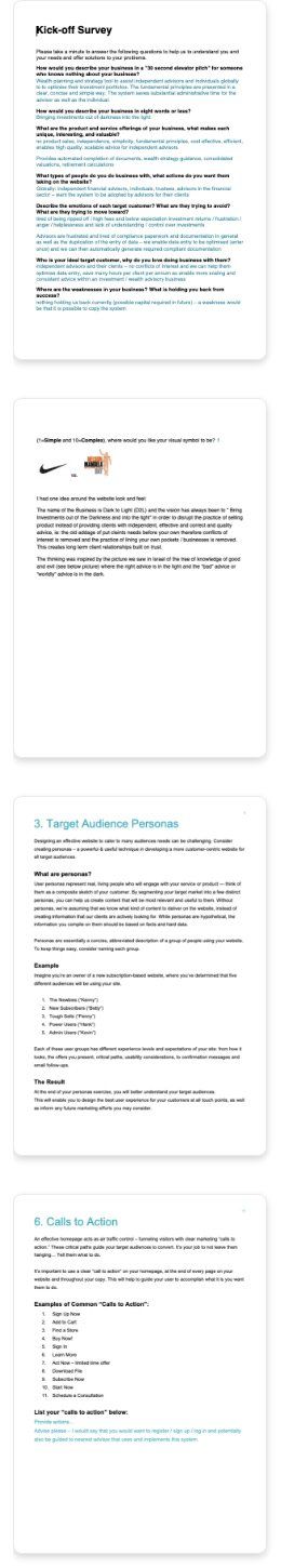
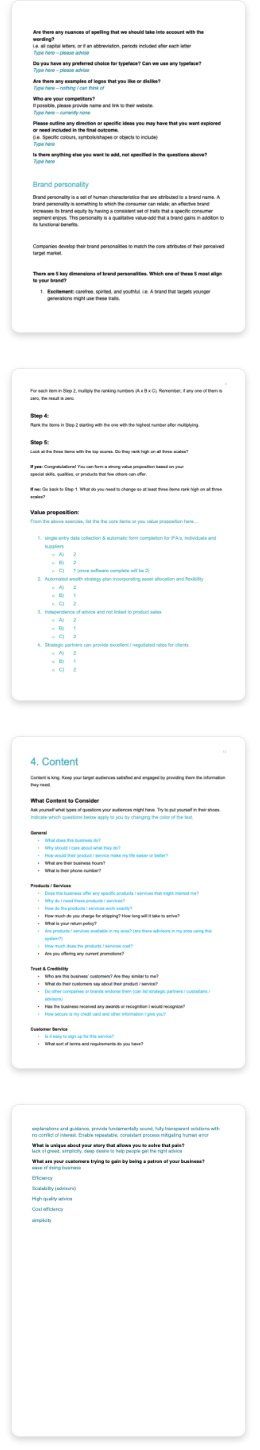
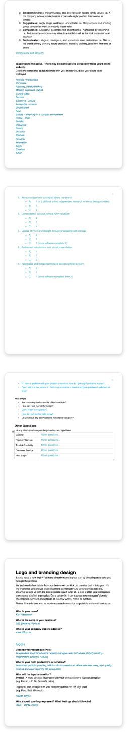
Due to the limited time allocated to this project and the large scope of work, I created three survey worksheets to do most of my discovery. The client was required to complete these before I started work on the project.
Planner
worksheet
This worksheet set the tone and plan for the marketing website rollout and design. In addition I consulted in several workshops with D2L to unpack details of their software and provide my suggestions.
The following was covered:
- Their value proposition
- Website goals
- Target audience personas
- Content
- Competitive positioning
- Calls to action
- Site map
Brand survey
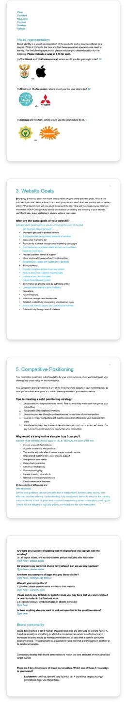
The brand survey focused more on the brand itself, its' story and how it should be portrayed.
Topics around the following were covered:
- The primary services/products the brand should be known for
- Key dimensions of the brands personality
- Visual representation and preference scoring between
- Traditional vs contemporary
- Small vs corporate
- Serious vs fun
- Simple vs complex
Kick-off survey
This survey gave me a better understanding of the D2L business, its offerings and goals, as well as expectations for the project.
Topics around the following were covered:
- What the businesses ideal target customer looked like
- Market opportunities and competitive advantages
- The business's fears, frustrations and pains
- Their customers/clients fears, frustrations and pains and how D2L addresses these
Surveys and findings documentation:
Exploration and validation
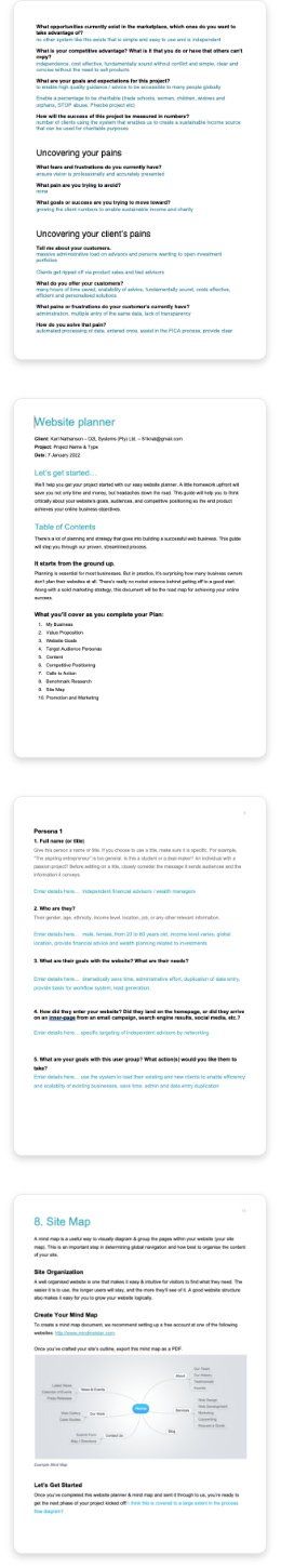
Taking into consideration the various aspects the D2L brand wanted to embody, we began exploring various concepts before landing on the final designs.
Logo design
D2L derived its name from 'Dark to Light', the company would help bring people's finances out of the dark and into the light. We explored this concept, anagrams and other marks while designing the logo. Work began with various sketches and was later moved to the computer for further refinement. After a few rounds and revisions, we landed on our final logo design.
Initial sketches and exploration:


Final logo design:
Exploring look and feel
Style scape concepts and persona context
Carefully crafted style scapes were used to explore the visual look and feel for the brand. These described things like colour, visual direction, hierarchy and typography styles. This helped to visualise the context for how users could experience the brand visually.
Pictures representing our audience personas (identified in our discovery sessions) were placed into these mockups. This helped our stakeholders connect their target audience to the brands potential appeal.
Three mockups where provided and the last option below was chosen.
Style scapes created:


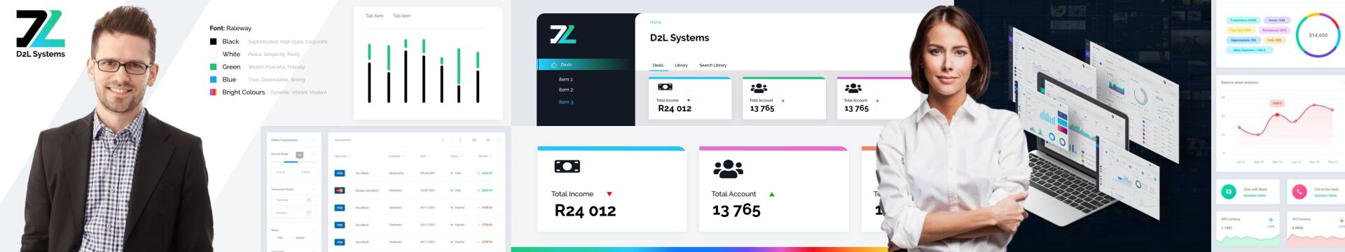
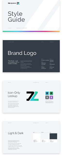
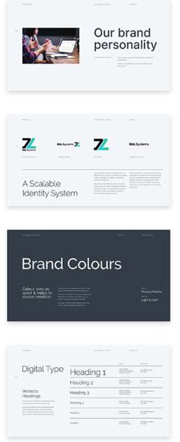
Brand identity system
All elements (including logos) were delivered in a variety of formats, for light and dark, vertical and horizontal formats and the brand symbol. This was accompanied by a brand identity style guide for all the provided brand assets.
Pages from the brand style guide:


Workshopping requirements for the web application
The product's goal was to digitise a process that was traditionally managed via PDF forms and Excel documents. Many examples of existing processes were shared with me to reference while designing.
I was also walked through the product's vision, functional requirements and we had several online workshops unpacking the expectations for the product deliverables.
Various sketches were also shared as we discussed the application business logic and end user requirements (some shown here).


Scope and architecture
Following the discovery work, I documented the project scope and application architecture. This helped to define what we were designing and building for, as part of the initial product handover.
Content mapping
With a structure in place, and several reference documents (Excel spreadsheets and PDF forms), I started mapping content to the application's structure.
This helped identify missing information, what was still required and helped me to ensure everything was accounted for as I started designing.

Planning user flows and layout patterns
During our research phase, it became evident that we had two primary users with slightly different goals and requirements. Our goal was to make something simple and easy to use while creating a single application experience for all users.
This planning was done using wireframes, these showcased the application layout and patterns. Wireframes were then turned into flow diagrams for the two different user experiences.
Flow for independent advisors and wealth managers:

Flow for independent advisors and wealth managers:
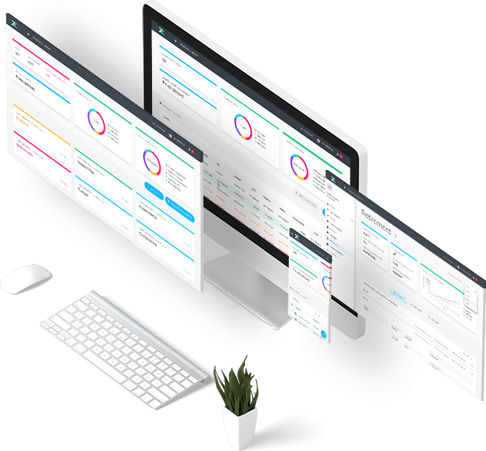
Designed features and solutions
Taking into consideration the various aspects the brand wanted to embody and the functional requirements for the application, we explored concepts before landing on the final designs and solutions. Below is a summary of some of these solutions.
A responsive layout pattern
As a web based application, I had to consider how the interface would translate from a large desktop format down to a mobile experience.

- Top toolbar – used to house branding and quick links to resources and relevant profiles
- Secondary navigation panel – The left navigation panel allowed for quick access to the different sections within the application. On mobile, this is accessed via the menu link in the top toolbar
- Overview panel – used to contain graphs summarising data for a quick reference summary. This area became a horizontal scrolling area on mobile devices
- Content area – the main content for all pages is situated in this space
- Quick link actions – common actions could be easily accessed here, relevant to each section of the app. On mobile, this element was treated as a floating action button, persistent at the bottom of the screen.
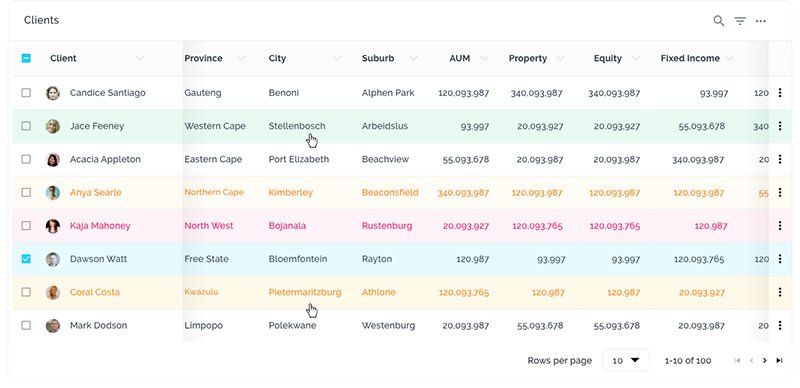
Colour psychology was used throughout the application to help users quickly identify the status or progress of various operations throughout the application.
- Red – Requires action
- Yellow – In progress
- Green– Healthy
- Blue -
Neutral
Card designs showing status:

Table design showing status:

Status at a glance
Examples:


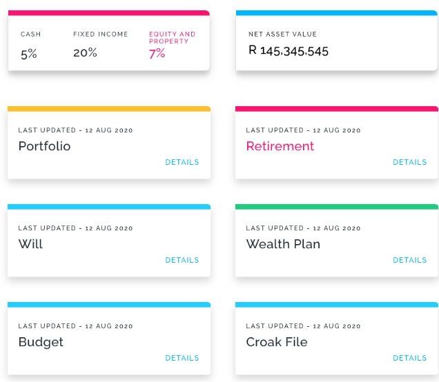
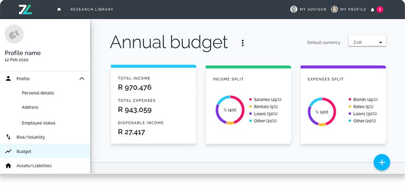
Quick reference and health check
To enable quick reference or financial health checks, I utilised the top area of each page to house key information and graphs.
Notifications
All items that required user action were collated and listed under the notifications bell in the top toolbar. Clicking a notification would take the user directly to the relevant section within the application.
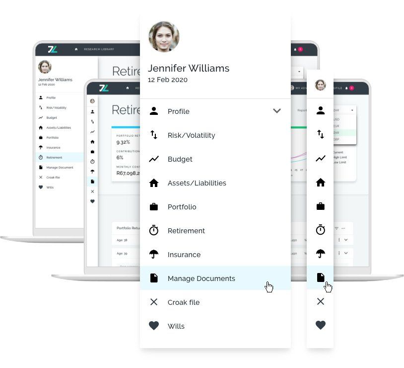
Profiles
Within the top toolbar, in addition to the user profile link, I also included their financial advisors profile (if registered on the app). This provided the user with quick access to the advisors details .


Sidebar/toolbar
This feature was designed to help maximise screen real- estate in the main content area of the application.
Iconography was carefully chosen and included next to the navigation list in the sidebar. With repeat use, users would learn what these icons represented, allowing them to collapse the sidebar to a more compact toolbar.
Review and approving edits
Advisors’ clients needed the ability to make changes on certain input fields within their profile. Their financial advisors needed the ability to review and accept these changes. Colour was used to show what needed attention or to indicate pending changes.
Client view
Proposed update

When a client edited content, the capture field changed colour and a “Proposed update” label is displayed. The client's proposed change could be canceled at any time before being accepted their advisor.
Advisor view
Proposed update

Original input

For the advisor, the proposed changes would adopt the ‘attention required’ status in red. Advisors could toggle between the proposed change and the original content while reviewing before accepting or rejecting the change.
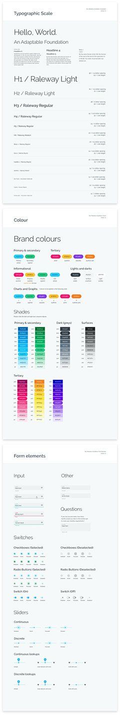
Design system
A design system was also established during the process. All UI elements and components were documented and shared with the engineering team who translated the designs into code. This was also referenced during the next phase of the project when designing the marketing website.


Approaching
the website
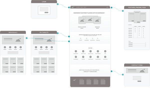
The marketing website processes started by distilling the work done in the discovery phase. The website focused on landing the product and the specific needs and benefits of our two primary audiences.
Wireframes were put together to help define the different pages and how a user would move through the website. The primary goal of the website was to capture leads.


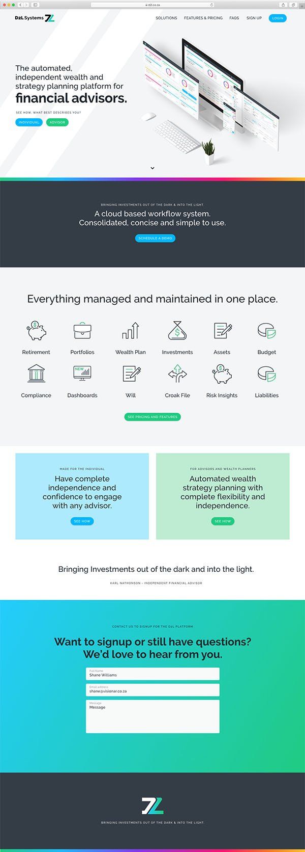
Home page structure
- Top of page hero area - Right upfront, we mention what the product was about and who it's for (the words “Financial advisors” and “Individuals” continuously swapped out with a simple animation) while showing what the product looks like
- The D2L
value proposition and call to action to schedule a demo
- Everything the application managed was listed with another call to action to explore a full list of
product features
- Target users are hooked by addressing their primary need with an invitation to explore more
- Social proof - a space was created to house client testimonials/quotes
(Research shows users are more inclined to believe what others say, than if you said it yourself) - Lead generation form
Audience specific landing pages
Content on these pages addressed all the user needs and frustrations we had identified. This was showcased by calling out various product benefits and features (see high fidelity designs below).
These pages provided ideal clickthrough landing pages from marketing campaigns that were targeting specific audiences.
High fidelity design
Wireframes were then translated into high fidelity designs for final sign-off.
Below are the final designs that were handed over.
Homepage:

‘Individuals’ landing page:

‘Financial advisor’ landing page:

Pricing page:

LEARNINGS
What this project taught me.
Challenges
User testing was done primarily by the stakeholders due to the NDA restrictions put in place at the start of the project.
I was, unfortunately, not able to see the final build of the application, due to the limited scope of work I was assigned to, but the team was very confident in the foundational work delivered, and the project was taken in-house for completion.
Key takeouts
Keep an open dialogue
Due to the technical complexities of this project and limited time to execute, keeping an open dialogue with developer and the end client was key to this project’s success.
Never design anything in isolation.
Always place components in the context of the screen to reveal more information about how they interact within the product and broader interface.
Simplicity is possible and can be achieved out of complexity
“Everything should be made as simple as possible, but not simple”
Albert Einstein